Tuix
Introduction
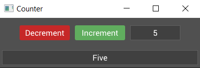
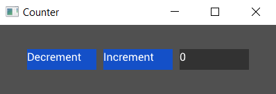
This quick-start guide will cover the basic concepts for getting started with tuix. By the end of the guide we will have built a simple counter app with buttons to increment and decrement the count, as well as two labels showing different views on the same data. Here's a screenshot of the finished app:
Setup
Start by creating a new rust binary project in a location of your choosing by running the following command:
cargo new tuix_counter
This should create a new folder called tuix_counter which should contain: a src directory with a main.rs file, and a Cargo.toml file.
Open the Cargo.toml file in your editor of choice and add the following under the [dependencies] section:
tuix = { git = "https://github.com/geom3trik/tuix.git", branch = "reactive" }
This tells rust to include tuix as an external dependency.
Next, open the main.rs file and remove the hello world example code. When you're ready, move on to the next section where we'll build the simplest tuix app.
Creating an Application
Add the following code to the main.rs file:
extern crate tuix;
use tuix::*;

fn main() {
    let mut app = Application::new(WindowDescription::new(), |state, window| {});

    app.run();
}
This is the simplest possible tuix app.
Build and run this code by executing the following command:
cargo run
You should see an empty gray window appear. Yay! Now to explain what the code does:
The first argument passed to Application::new() is a new instance of a WindowDescription. This allows us to set the initial properties of the root window created for us by tuix. Currently, tuix can only create single window applications, but multiwindow is in the works!
The second argument passed to the new method is a closure which provides us with two arguments:
-
state- This is a mutable reference to the UIState, which represents the 'global' data of the widgets in a gui application, such as layout and style properties. A mutable reference to state is passed around when building widgets, handling events, and drawing widgets. -
window- This is anEntityid to the window widget created for us by tuix. Every widget has an entity id which is used with state to modify UI properties.
In the next section we'll cover changing window properties like the title and inner size.
Setting Window Properties
Window properties can be set using the WindowDescription, which is the second argument of the closure passed to Application::new().
Lets add a custom title to our application window. It will eventually be a counter, so let's go with that:
extern crate tuix;
use tuix::*;

fn main() {
    let app = Application::new(
        WindowDescription::new().with_title("Counter"),
        |state, window|{}
    );

    app.run();
}
Using the builder pattern, setting window properties can be chained together. Let's change the size of the window to just 400 by 100. We don't need all that space for a simple counter:
extern crate tuix;
use tuix::*;

fn main() {
    let app = Application::new(
        WindowDescription::new().with_title("Counter")
        .with_inner_size(400, 100),
        |state, window|{}
    );

    app.run();
}
To see the full list of window properties that can be set, see the docs page on WindowDescription. This will do for now, let's move on to adding widgets to our application.
Adding a Button
For our counter we know we will need two buttons (for increment and decrement) and at least one label (to show the value). But to start with let's just add one of the buttons to our window with the following code:
extern crate tuix;
use tuix::*;

fn main() {
    let window_description = WindowDescription::new()
        .with_title("Counter")
        .with_inner_size(400, 100);
    let app = Application::new(window_description, |state, window| {

        // Add an Button widget
        Button::with_label("Increment")
            .build(state, window, |builder| builder);
    });

    app.run();
}
To add the button widget we create a new instance with Button::with_label("Increment"). This creates a new button and also gives it some text to use as a label. If we didn't want any text we could have also used the ::new() method.
The button instance is then built into the app with .build(state, window, |builder| builder).
-
The first argument,
state, is a mutable reference toStatefrom the application closure. -
The second argument is the entity id of the parent widget, in this case the window widget, which is the second argument of the application closure. Each widget has an
Entityid which can be used to get and set various widget properties stored inState, and used to identify parent widgets to their children. -
The third argument is a closure which provides us with a builder we can use to set properties of the newly created widget, which we'll cover in a moment.
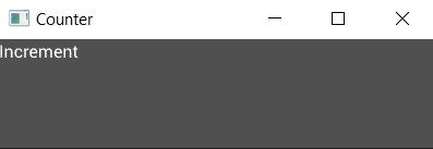
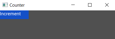
If you build and run this code though you will see an almost empty window with just the text "Increment" in the top left corner:
This is because the Button widget has no built-in styling. To see the button, we can add a width, height, and background color using the builder like so:
extern crate tuix;
use tuix::*;

fn main() {
    let window_description = WindowDescription::new()
        .with_title("Counter")
        .with_inner_size(400, 100);
    let app = Application::new(window_description, |state, window| {

            Button::with_label("Increment").build(state, window, |builder| {
                builder
                    .set_width(Pixels(100.0))
                    .set_height(Pixels(30.0))
                    .set_background_color(Color::rgb(20, 80, 200))
            });

        },
    );

    app.run();
}
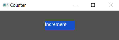
This will produce a nice blue button in the top left corner of the window with a width of 100 pixels and a height of 30 pixels, and with a text showing "Increment". Note that the text is not aligned in the center of the button. This will be fixed later in the guide during styling.
In the next section we will look at how to move our button into a more interesting position.
Positioning the Button
Okay so we have a button, but it's up in the top left when really it should be in the center. If you're coming from web dev then you might be thinking, "oh no, not centering!". But fear not, it's super easy in tuix.
The way we center a widget in tuix is to add stretch spacing to all sides:
extern crate tuix;
use tuix::*;

fn main() {
    let window_description = WindowDescription::new()
        .with_title("Counter")
        .with_inner_size(400, 100);
    let app = Application::new(window_description, |state, window| {

            Button::with_label("Increment").build(state, window, |builder| {
                builder
                    .set_width(Pixels(100.0))
                    .set_height(Pixels(30.0))
                    .set_background_color(Color::rgb(20, 80, 200))
                    .set_space(Stretch(1.0))
            });

        },
    );

    app.run();
}
Running this code shows our button now in the center. Easy peasy!
Hang on though, what the heck is stretch space?
Okay, so while layout in tuix is highly customizable and flexible, it's quite a big topic for a quick start guide. So for now, here's a short description, and a more detailed guide can be found the the layout section.
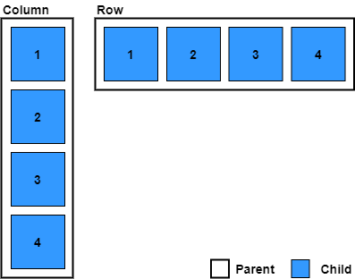
- Widgets are positioned by their parent into a row, column, or grid with their siblings, determined by parent layout-type.
- Widgets can be moved, relative to their stack or grid position, by adding space to each of their sides, left, right, top, and bottom, (or space for all four at once).
- Space comes in four varieties:
- auto - can be overridden by parent
- stretch - a proportion of the remaining free space
- percentage - a proportion of the parent width/height
- pixels - an exact number of pixels
- The parent can apply space to all of its children, if their corresponding space properties are set to auto (which is the default unless otherwise set/specified), using child-left, child-right, child-top, child-bottom, or child-space. Also specified with the same four possible units.
- The parent can also apply horizontal space between its children, with col-between, as vertical space, with row-between. All specified with the same for possible units.
There are more rules but to keep things short the above overview should be sufficient for the rest of this quick-guide.
By adding stretch space to each side of the button we are telling tuix to add space which fills the available free space, which causes the button to become centered.
In the next section we'll look at adding more widgets and composing them together.
Composing Widgets
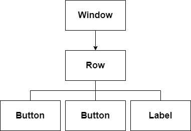
So far our counter has only a single button. Let's add another button and a label, as well as a Row widget to be the parent of our buttons and label. A Row widget, as the name suggests, lays out its children in a horizontal row:
extern crate tuix;
use tuix::*;

fn main() {
    let window_description = WindowDescription::new()
        .with_title("Counter")
        .with_inner_size(400, 100);
    let app = Application::new(window_description, |state, window| {

        let row = Row::new().build(state, window, |builder| builder);

        Button::with_label("Decrement").build(state, row, |builder|
            builder
                .set_width(Pixels(100.0))
                .set_height(Pixels(30.0))
                .set_background_color(Color::rgb(20,80,200))
                .set_space(Stretch(1.0))
        );

        Button::with_label("Increment").build(state, row, |builder|
            builder
                .set_width(Pixels(100.0))
                .set_height(Pixels(30.0))
                .set_background_color(Color::rgb(20,80,200))
                .set_space(Stretch(1.0))
        );

        Label::new("0").build(state, row, |builder|
            builder
                .set_width(Pixels(100.0))
                .set_height(Pixels(30.0))
                .set_background_color(Color::rgb(50,50,50))
                .set_space(Stretch(1.0))
        );

    });

    app.run();
}
Building the second button widget works in the same way as the first. However, notice that the building of both buttons now uses row as the parent. This is the Entity id of the Row widget instance and is returned by its .build(...) method. The row uses the window as its parent.
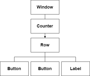
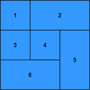
Composing these widgets like this forms a tree, where each widget has a single parent and zero or more children. In tuix, this tree is used to propagate events as well as to draw the elements in the correct order. Below is a diagram depicting the current tree of widgets:
Running this code produces:
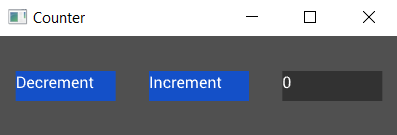
Woah! All our widgets are spaced out across the window! Can you see why?
The default width and height of a widget, if not specified, is to stretch to fill the available space. So the Row widget has stretched to fill the window, although we can't see it directly because it has no background color.
The buttons and label all have space around them set to stretch, which results in equal spacing between them, as well as centering them as a collection within the row.
Let's remove the calls to set_space on each of the widgets and add two new methods on the builder for the row:
Row::new().build(state, window, |builder|
    builder
        .set_child_space(Stretch(1.0))
        .set_col_between(Pixels(10.0))
);
This sets the space around all of the children of the row (our buttons and label) to stretch, and also sets a fixed horizontal spacing between them of 10 pixels:
In the next section we'll add some styling to our app.
Styling the App
Our app now consists of two blue buttons and a gray label. Let's be honest, that doesn't look great and it doesn't feel like a GUI yet. The buttons don't even do anything when you hover and press them.
To fix this we will add style to our widgets. Tuix has two forms of styling:
- inline
- shared
So far we have defined our style properties directly on the widgets using the builder, also known as inline styling. Tuix also offers the ability to define style rules to allow shared styling between multiple widgets. The widgets affected by these shared style rules are determined by selectors which should be familiar to web developers using css and work in much the same way.
Before we can add a shared style we need to give the widgets some class names, using the .class() method on the builder, so we can target them with selectors:
Button::with_label("Decrement").build(state, row, |builder|
    builder
        .set_width(Pixels(100.0))
        .set_height(Pixels(30.0))
        .set_background_color(Color::rgb(20,80,200))
        .set_space(Stretch(1.0))
        .class("decrement")
);

Button::with_label("Increment").build(state, row, |builder|
    builder
        .set_width(Pixels(100.0))
        .set_height(Pixels(30.0))
        .set_background_color(Color::rgb(20,80,200))
        .set_space(Stretch(1.0))
        .class("increment")
);
Here we've added "increment" and "decrement" class names to our buttons. Now we can write some css to affect the styling of our widgets. Add the following to the top of the main.rs file just below the use tuix::* line:
const STYLE: &str = r#"
    button {
        border-radius: 3px;
        child-space: 1s;
    }

    button.increment {
        background-color: #2e7d32;
        border-radius: 3px;
    }

    button.increment:hover {
        background-color: #60ad5e;
    }

    button.increment:active {
        background-color: #005005;
    }

    button.decrement {
        background-color: #c62828;
        border-radius: 3px;
    }

    button.decrement:hover {
        background-color: #ff5f52;
    }

    button.decrement:active {
        background-color: #8e0000;
    }

    label {
        background-color: #404040;
        border-color: #606060;
        border-width: 1px;
        child-space: 1s;
    }
"#;
Since this isn't a css guide, we won't go into detail on how this works. But more information can be found in the styling section of the book.
Now we need to add the stylesheet to the app by calling state.add_theme(STYLE). Typically this is done in the application closure before creating any widgets.
Note also that inline properties override shared properties, so for the buttons to be affected we need to remove the calls which set their color on the builder.
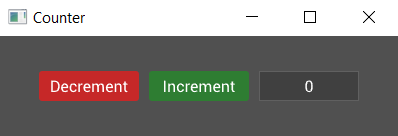
A screenshot of the result is shown below. Note also that we've now fixed the text alignment within the widgets using the child-space property, which applies to both child widgets and text.
And the complete code is:
extern crate tuix;
use tuix::*;

const STYLE: &str = r#"
    button {
        border-radius: 3px;
        child-space: 1s;
    }

    button.increment {
        background-color: #2e7d32;
        border-radius: 3px;
    }

    button.increment:hover {
        background-color: #60ad5e;
    }

    button.increment:active {
        background-color: #005005;
    }

    button.decrement {
        background-color: #c62828;
        border-radius: 3px;
    }

    button.decrement:hover {
        background-color: #ff5f52;
    }

    button.decrement:active {
        background-color: #8e0000;
    }

    label {
        background-color: #404040;
        border-color: #606060;
        border-width: 1px;
        child-space: 1s;
    }
"#;

fn main() {
    let window_description = WindowDescription::new()
        .with_title("Counter")
        .with_inner_size(400, 100);
    let app = Application::new(window_description, |state, window| {

        state.add_theme(STYLE);

        let row = Row::new().build(state, window, |builder|
            builder
                .set_child_space(Stretch(1.0))
                .set_col_between(Pixels(10.0))
        );

        Button::with_label("Decrement").build(state, row, |builder|
            builder
                .set_width(Pixels(100.0))
                .set_height(Pixels(30.0))
                .class("decrement")
        );

        Button::with_label("Increment").build(state, row, |builder|
            builder
                .set_width(Pixels(100.0))
                .set_height(Pixels(30.0))
                .class("increment")
        );

        Label::new("0").build(state, row, |builder|
            builder
                .set_width(Pixels(100.0))
                .set_height(Pixels(30.0))
        );

    });

    app.run();
}
Tuix also offers the ability to define styles in separate stylesheet files with .css extensions, which can then be included with the include_str! macro. However, although some of the style properties available in tuix share the same name as css properties, in general the available style properties are different.
Alternatively, state.add_stylesheet() can be used to add a stylesheet dynamically by specifying the path to the css file. This allows for hot reloading of the stylesheet using the F5 key, however, the css file must be shipped with the executable.
In the next section, we'll move what we've made so far into its own custom widget with a variable for the actual count.
Creating a Counter Widget
Our code so far produces something that looks like it could be a counter but it doesn't do anything yet. In the next section we'll dive into events and how we can use them to add some functionality to the app, but first we need to cover the concept of custom widgets.
So far we've used some of the built-in widgets in tuix to build our app, but it's time to build our own Counter widget to contain what we've built so far, and we'll also need it to react to events.
Start by creating a struct called Counter, and we'll derive Default so we don't need to write a constructor:
#[derive(Default)]
struct Counter {
    value: i32,
}
Our counter contains the actual count value, an i32, which we'll need for later.
To make our Counter struct a widget we just need to implement the Widget trait for it like so:
impl Widget for Counter {
    type Ret = Entity;
    type Data = ();

    fn on_build(&mut self, state: &mut State, entity: Entity) -> Self::Ret {
        entity
    }
}
Let's take a moment to break down the pieces of the Widget trait. There are two associated types, Ret and Data:
- The
Retassociated type is used to specify what should be returned when the widget is built. Typically a widget will return itsEntityid, but a widget could be made up of several sub-widgets, some of which the user may need access to when building. In these cases theRettype can be set to a tuple, such as(Entity, Entity). For our counter we'll just return anEntity. - The
Dataassociated type is used by the binding system, which for now we will save for a later section of the guide. In the meantime you can set this to().
The Widget trait has a few methods, but only the on_build() method is required to be implemented, and must return the Ret associated type. Usually this will be the entity id of the widget which is passed as an argument to the function.
The on_build method is called once when the widget is first built. So when we called build() on the buttons and label, their respective on_build() methods were called. It is within this function that we can build the components which will make up our widget. Note also that this method provides a mutable reference to Self, so we can access fields like our counter value, and a mutable reference to State, so we can set inline style properties of the widget at build time, using the entity id.
For the counter, we'll move the row, buttons, and label into the body of this method, making sure to change the parent of the row from window to entity (the id given to the Counter widget when it is built).
impl Widget for Counter {
    type Ret = Entity;
    type Data = ();

    fn on_build(&mut self, state: &mut State, entity: Entity) -> Self::Ret {

        // Note the change from window to entity
        let row = Row::new().build(state, entity, |builder|
            builder
                .set_child_space(Stretch(1.0))
                .set_col_between(Pixels(10.0))
        );

        Button::with_label("Decrement").build(state, row, |builder|
            builder
                .set_width(Pixels(100.0))
                .set_height(Pixels(30.0))
                .class("decrement")
        );

        Button::with_label("Increment").build(state, row, |builder|
            builder
                .set_width(Pixels(100.0))
                .set_height(Pixels(30.0))
                .class("increment")
        );

        Label::new("0").build(state, row, |builder|
            builder
                .set_width(Pixels(100.0))
                .set_height(Pixels(30.0))
        );

        entity
    }
}
Now that we have a counter widget, which contains our buttons and label, how do we use it? Well, the same as any other widget! Where we had the row, buttons, and label, insert the following line:
Counter::default().build(state, window, |builder| builder);
As with the row widget, the counter by default will fill the available space, and running the code appears to produce the same result as we had before:
That seemed like a lot of work for no noticeable change. However, it's in the next section that things get interesting for our counter widget.
Also, here is the complete code so far:
extern crate tuix;
use tuix::*;

const STYLE: &str = r#"

    button {
        border-radius: 3px;
        child-space: 1s;
    }

    button.increment {
        background-color: #2e7d32;
        border-radius: 3px;
    }

    button.increment:hover {
        background-color: #60ad5e;
    }

    button.increment:active {
        background-color: #005005;
    }

    button.decrement {
        background-color: #c62828;
        border-radius: 3px;
    }

    button.decrement:hover {
        background-color: #ff5f52;
    }

    button.decrement:active {
        background-color: #8e0000;
    }

    label {
        background-color: #404040;
        border-color: #606060;
        border-width: 1px;
        child-space: 1s;
    }
"#;

#[derive(Default)]
struct Counter {
    value: i32,
}

impl Widget for Counter {
    type Ret = Entity;
    type Data = ();

    fn on_build(&mut self, state: &mut State, entity: Entity) -> Self::Ret {
        let row = Row::new().build(state, entity, |builder|
            builder
                .set_child_space(Stretch(1.0))
                .set_col_between(Pixels(10.0))
        );

        Button::with_label("Decrement").build(state, row, |builder|
            builder
                .set_width(Pixels(100.0))
                .set_height(Pixels(30.0))
                .class("decrement")
        );

        Button::with_label("Increment").build(state, row, |builder|
            builder
                .set_width(Pixels(100.0))
                .set_height(Pixels(30.0))
                .class("increment")
        );

        Label::new("0").build(state, row, |builder|
            builder
                .set_width(Pixels(100.0))
                .set_height(Pixels(30.0))
        );

        entity
    }
}

fn main() {
    let window_description = WindowDescription::new()
        .with_title("Counter")
        .with_inner_size(400, 100);
    let app = Application::new(window_description, |state, window| {

        state.add_theme(STYLE);

        Counter::default().build(state, window, |builder| builder);

    });

    app.run();
}
Events
Alright, we've got a nice looking counter but how do we make it do something? Time for some events!
Handling Events
The Widget trait has another method called on_event which will allow us to react to events and change the internal data (the counter value) and child widgets (the buttons and label) of our counter. Add the following to the implementation of the Widget trait for our counter, right below the on_build() method:
fn on_event(&mut self, state: &mut State, entity: Entity, event: &mut Event) {

}
Note that the method signature is very similar to on_build but, instead of returning something, there's an extra argument, a mutable reference to some Event.
Messages
So what is the event? Well an event is a struct which contains a Message and some meta data about the event, like its origin and target entities. Okay so what's a Message? Well a message is a dynamic object pointer to some user defined type. In fact it can be any type as long as it implements PartialEq. So let's make a message type which we can respond to. Add this just before we declare the Counter struct:
#[derive(PartialEq)]
pub enum CounterEvent {
    Increment,
    Decrement,
}
Now we can modify the on_event method to do something when it receives this type of event:
fn on_event(&mut self, state: &mut State, entity: Entity, event: &mut Event) {
    if let Some(counter_event) = event.message.downcast() {
        match counter_event {
            CounterEvent::Increment => {
                self.value += 1;
            }

            CounterEvent::Decrement => {
                self.value -= 1;
            }
        }
    }
}
Here we attempt to downcast the message within the event to the ConterEvent type, and on success match against the options, incrementing or decrementing the counter value in response.
Okay, so our counter widget can now respond to counter events, but how does it get them? Something needs to send those events. How about those buttons?
Callbacks
To send events when our buttons are pressed we need another new concept, which is callbacks. Most widgets allow you to set a callback (a closure) which will run when the widget is interacted with or changes state. In this case it's probably best to learn by example so change the decrement button to look like this:
Button::with_label("Decrement")
    .on_press(|data: &mut Button, state: &mut State, button: Entity|{
        button.emit(state, CounterEvent::Decrement);
    })
    .build(state, row, |builder|
        builder
            .set_width(Pixels(100.0))
            .set_height(Pixels(30.0))
            .class("decrement")
    )
For clarity I've included the argument types but these can be inferred by the rust compiler. Notice that the arguments shadow those of on_build and the first 3 of on_event, providing a mutable reference to the widget (Button in this case), a mutable reference to State, and the Entity id of the button.
Using the button id and state we call emit() to send a CounterEvent::Decrement event. As the name suggests, this callback will be triggered when the button is pressed.
But where does the event go? Remember that tree which was mentioned before? Well, by default, events are sent up the tree, hitting every ancestor on its way to the root (the window). Because the button is a descendant of the counter (counter -> row -> button), the counter will receive the event after the button is pressed. The figure below depicts the tree of widgets with our custom counter widget:
We're almost there. Adding in the callback for the increment button (left as an exercise for the reader), we now have a counter whose value will change when the buttons are pressed! Hang on though... nothing seems to be happening... the label still shows zero. Ah, we need to make two more modifications to update the label.
First, we need to store the entity id of the label in the counter so we can access it in on_event. Change the Counter to:
#[derive(Default)]
struct Counter {
    value: i32,
    label: Entity,
}
and then the label to:
// We now assign the output of the label build to the label variable
self.label = Label::new("0").build(state, row, |builder|
    builder
        .set_width(Pixels(100.0))
        .set_height(Pixels(30.0))
);
Finally, we need to update the label text in the on_event method:
fn on_event(&mut self, state: &mut State, entity: Entity, event: &mut Event) {
    if let Some(counter_event) = event.message.downcast() {
        match counter_event {
            CounterEvent::Increment => {
                self.value += 1;
                self.label.set_text(state, &self.value.to_string());
            }

            CounterEvent::Decrement => {
                self.value -= 1;
                self.label.set_text(state, &self.value.to_string());
            }
        }
    }
}
We can set the label this way because every widget has a text property which can be set through its entity id. If this was a more complicated widget, such as a slider, then we would update it using an event targeted at the widget. For example, we could send a SliderEvent::SetValue() event to a slider widget to update it.
We finally have a working counter!
You can find the full code for this guide so far in the examples/counter.rs file in the tuix repository. Run with cargo run --release --example counter.

In the next section we'll start to look at how we can make our counter widget more re-usable with some reactivity.
Reactivity and Model Data
In the previous sections we built a simple counter widget. This widget could now be embedded into a more complex gui and work just fine, keeping its own count. However, this isn't always the most practical solution. What if we had two counters and we wanted them to be synced to the same value? Okay we could send some events from one to the other but this isn't always so easy, especially if the widgets are 'far' away from each other within the tree.
The example of two counters being synced is a bit contrived but the issue of sharing application data between widgets is important and leads to reactivity as the solution. What is reactivity? For tuix, reactivity is the ability for widgets to 'bind' to application data, so that when the data changes, all the bound widgets update their state automatically. It's this ability which allows for more scalable applications.
In this section and the next we will modify our counter by adding another separate label, and syncing both our counter and the label to some shared data.
Model Data
We'll start with the counter example as we left it in the previous section.
First we need to add a struct for the shared application data:
#[derive(Default)]
struct CounterState {
    value: i32
}
Just like the counter widget before, this struct contains an i32 value to represent the count.
To allow this data to be embedded within the gui tree we need to implement the Model trait for it:
impl Model for CounterState {

}
The Model trait is similar to the Widget trait but is used for non-visual data. It also contains an on_event method to respond to events, and allows us to build the data into the tree.
Modify the implementation of Model on CounterState so that it updates the value in response to a CounterEvent within the on_event method, just like we did for our custom counter widget before:
impl Model for CounterState {
    fn on_event(&mut self, state: &mut State, entity: Entity, event: &mut Event) {
        if let Some(counter_event) = event.message.downcast() {
            match counter_event {
                CounterEvent::Increment => {
                    self.value += 1;
                    entity.emit(state, BindEvent::Update);
                }

                CounterEvent::Decrement => {
                    self.value -= 1;
                    entity.emit(state, BindEvent::Update);
                }
            }
        }
    }
}
Note the call to emit a BindEvent::Update event at each point the value is changed. Tuix does not (yet) provide a built-in method to detect changes of application data, so this event must be sent manually so bound widgets so they receive an update.
Building Model Data
Now that we have our application data in a separate struct we need to build it into the app. Insert this code into the application closure above the call to create and build the counter widget:
let app_data = CounterState::default().build(state, window);
Note that the build function on CounterState does not contain a builder closure because this isn't a visual widget.
Next, make sure to change the parent of the counter to the application data:
Counter::default().build(state, app_data, |builder| builder);
We have now inserted the app data just below the root of the application (the window) but above everything else. This means that any events that are sent up from widgets in the app will make their way to the app data thanks to it being an ancestor of everything below it.
Pressing the buttons of the counter will now modify the app data, but the label is still showing the internal value of the Counter. In the next section we'll modify our counter to remove the internal value and hook it up to our shared app data.
Lenses and Binding
In the previous section we built some application data near the root of our gui app, but pressing the counter buttons still displays the internal value of our counter widget.
Let's remove the on_event of the Counter and the value field as well. Now the counter contains no count value, so we need to hook it up to the app data count value instead.
First, modify the declaration of the CounterState struct to add the Lens derive macro like so:
#[derive(Default, Lens)]
struct CounterState {
    value: i32,
}
We'll go over lenses and what the Lens derive macro is doing in more detail in a moment, but let's take a look at binding our label to the counter value.
Binding
With the Lens derive we can now bind the label in our counter to the value in the counter state with the bind method. Change the label to the following:
self.label = Label::new("0")
    .bind(CounterState::value, |value| value.to_string())
    .build(state, row, |builder|
        builder
            .set_width(Pixels(100.0))
            .set_height(Pixels(30.0))
    );
Let's break down what's going on here. The bind method is placed between the creation of the label instance and the call to build. It has two arguments, a lens and a closure:
-
The first argument is a lens. We'll cover it in a moment but for now you can think of it as something which 'selects' a piece of a larger structure, in this case the
valuefield of theCounterStatestruct. -
The second argument is a closure which acts as a converter for the lensed data. The counter value is an
i32but the label expects aString, so we use the.to_string()method to convert the value to the expected type.
Lenses
At first glance the lens argument of the bind() method seems a bit magical. How are we accessing the value with CounterState::value? That doesn't seem like valid rust code. There's a few things going on here which are hidden by the Lens derive macro, so let's break it down.
A lens, at its core, is nothing more than a function which takes some data as input and returns a piece of that data as output, usually as references. In this case it would take an reference to some CounterState and return a reference to the value. This function is actually a method on a Lens trait, which looks something like this:
pub trait Lens {
    type Source;
    type Target;

    fn view<'a>(&self, data: &'a Self::Source) -> &'a Self::Target;
}
The derive macro creates for us a zero-sized static type and then implements this Lens trait on it, which might look something like this:
pub struct SomeGeneratedType;

impl Lens for SomeGeneratedType {
    type Source = CounterState;
    type Target = i32;

    fn view<'a>(&self, data: &'a AppData) -> &'a i32 {
        &data.value
    }
}
The other thing that the derive macro does is to create a static instance of the generated type, with the same name as the field (value), within a module called CounterState. This is what allows us to use CounterState::value to refer to the lens.
Binding Another Label
Now when we run the code we seemingly get the same counter behavior as before. The buttons update the value, via events, and the label receives the new value and updates its display. So why did we do this? Well, now we can do something more interesting, like bind another widget to the same value and display it in a different way, like printing the value as english text. Add the following dependency to the Cargo.toml file:
english-numbers = "0.3.3"
Then add a label to the application below the counter with the following bind method:
Label::new("Zero")
    .bind(CounterState::value, |value| english_numbers::convert_all_fmt(*value as i64))
    .build(state, data_widget, |builder|
        builder
            .set_space(Pixels(5.0))
    );
We bind the label to the same value and use the conversion closure to call a method from the english_numbers crate to convert the value to an english word. Now when the buttons are pressed to increment and decrement the counter, both labels update to show the value in two different ways!
In the next section we'll look at how we can make our counter widget more re-usable.
Making the Counter Reusable
Okay so we've got a reactive counter. It's reactive because when the value changes, via a button press, both labels update to show the new value without us having to explicitly send events to them.
However, with the way we've done it, our counter widget can't be used in another application unless it too has the same CounterState application data. We need to make our counter more generic.
When using our Counter widget in an app we won't have access to the label as it's built into the widget. So instead of binding to the label, we need to be able to bind to the counter widget itself.
The Data Associated Type
This is where the Data associated type comes in from the Widget trait, which we previously set to (). This associated type is used to specify the type of data a widget is expected to receive. It was mentioned before that a Label expects a String, which is because its associated data type is type Data = String.
Let's modify our counter to remove the bind method on the Label within the Counter widget, and change the data associated type to type Data = i32.
On Update
For actually updating the counter we'll use the on_update method provided by the Widget trait. Add the following code to the implementation of Widget for our Counter below the on_update method:
fn on_update(&mut self, state: &mut State, entity: Entity, data: &Self::Data) {
    self.label.set_text(state, &data.to_string());
}
As with the on_build and on_event methods, the first three arguments are the same: a mutable reference to Self so internal widget data can be modified, and a mutable reference to State followed by an Entity id, for modifying style and layout properties as well as for sending events.
In this case we use the internal label field (which is the entity id of label) to set its text to the data value (converted from i32 to a string) received when our counter widget is updated.
The last step is to add a call to bind() on the counter widget. Change the building of the counter widget to the following:
Counter::default()
    .bind(CounterState::value, |value: &i32| *value)
    .build(state, app_data, |builder| builder);
We pass the same lens as before to the value of the CounterState and the conversion closure converts the reference to the value into a copy.
So how does this work?
- Building the
Modelcreated aStore, which itself is a widget which contains the application data as well as a list of observer widgets (using entity ids). - The
bindmethod sends an event to the store which registers the widget as an observer. - Pressing a button sends an event up the tree to the store, which then mutates the data in response.
- The store then calls the
on_updatemethod of all bound widgets, passing the new updated value.
And we're done!
When we build and run our app now we get the same behavior as before but our counter widget is now re-usable! We could now add this counter widget into any application, and we just need to bind it to a piece of data, using the conversion closure to convert that data in some way to an i32. The label would then display the value. The only other part required is to respond to CounterEvent messages emitted by the counter's buttons.
The full code for this reactive counter can be found in the /examples/counter_reactive.rs file in the tuix repository and can be run with cargo run --release --example counter_reactive.
Conclusion
This concludes the tuix 'quick' guide! If you made it this far, thanks for reading! The rest of this book attempts to cover the concepts shown in this guide in more detail, demonstrating what features are available and how they can be used to build complex user interfaces.
Coming Soon...
Coming soon will be an 'advanced' guide in which a todo app will be created with more advanced features such as:
- Binding to lists of items
- 'Local' app data for syncing widgets in a sub-section of the tree
- Animations (almost all style and layout properties are animatable)
- Using more complex built-in widgets
- Constructing more complex custom widgets
Overview (Stack)
An overview of the layout system for working with stacks, in which child elements are positioned one after another.
- For stacking, a parent element can arrange its children into a vertical stack (
layout-type: column) or a horizontal stack (layout-type: row).
- A child element is positioned relative to its stack position (
position-type: parent-directed), or relative to the top-left of its parent (position-type: self-directed).
- A child element can be positioned by adding space to the
left,right,top, orbottomof an element.
- Spacing can be expressed in pixels, percentage, stretch, or auto (see 8). Stretch causes the spacing to be flexible, occupying a proportion of the remaining free space. By default, spacing is set to auto.
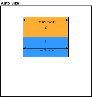
- The size of an element is determined by its
widthandheight, which can also be expressed in pixels, percentage, stretch and auto. By default, size is set to stretch.
- When size is set to auto, an element will 'hug' its children in that axis. This is also true for
min-width/min-height(see 10).
- A parent can add space around its stacked children with
child-space, or specified individually withchild-left,child-right,child-top,child-bottom, or add space between its child elements withchild-between.
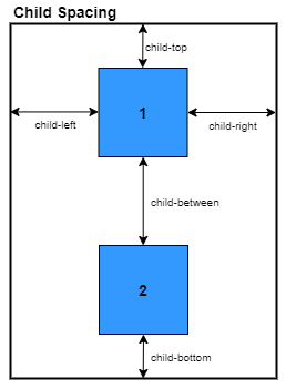
- Child spacing applies to elements with spacing set to auto.
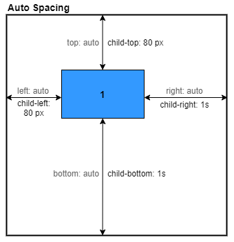
- Spacing set in pixels, percentage, or stretch overrides child spacing.
- All spacing and size properties have corresponding minimum and maximum constraint properties. For example, for
leftthere ismin-leftandmax-left. By default spacing and size minimums and maximums are set to auto. This will cause elements tohugtheir children if the size if flexible and goes below the minimum.
Overview (Grid)
An overview of the layout system for working with grids, in which child elements are positioned by row and column indices and span one or more rows and columns.
- A parent element can arrange its children into a grid (layout-type: grid).
-
The rows and columns of a grid can be expressed in pixels, percentage, stretch, or auto.
-
A child element specifies its position with a row index and column index.
-
A child element specifies its size by spanning a number of rows and columns.
Child Properies (TODO)
Position Type
This determines how an element will be positioned within its parent relative to other child elements.
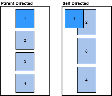
- self-directed - The element determines its own position, relative to the top-left corner of the parent, and is not affected by other elements in a stack or grid.
- parent-directed (default) - The element is positioned by the parent into a stack or grid.
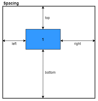
Spacing
There are four spacing properties that are used to specify the position an element within its parent:
- left - determines the space to the left of an element.
- right - determines the space to the right of an element.
- top - determines the space above an element.
- bottom - determines the space below an element.
The spacing properties behave somewhat like margins, adding space around an element.
Size
The size of an element is determined by two properties:
- width - determines the width of an element.
- height - determines the height of an element.
Like with all spacing and size properties, the value can be expressed in pixels, percentage, stretch, and auto.
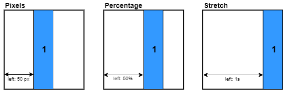
Pixels
Parent Properies (TODO)
Layout Type
Rust
enum LayoutType {
    Row,
    Column,
    Grid,
}
Stylesheet:
.container {
    layout-type: row | column | grid;
}
This determines how the child elements should be arranged in the parent.
- Row - Child elements are arranged into a horizontal stack from left to right
- Column - Child elements are arranged into a vertical stack from top to bottom
- Grid - Child elements are arranged into a grid (link here)
Child-Space
This determines the spacing around the elements in a stack (does not apply to grid).
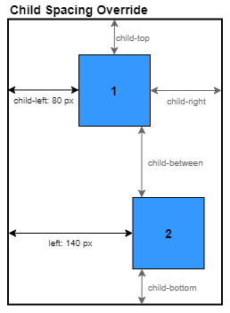
Each of the child spacing properties (see below), defined on the parent, acts to override the auto-spaced properties of the child elements. For example, the parent child-left property will override the left property of a child element if the left property is set to Units::Auto.
There are five child-space properties:
- child-left - determines the space to the left of the stack. Applies to the first element in a horizontal stack and all elements in a vertical stack.
- child-right - determines the space to the right of the stack. Applies to the last element in a horizontal stack and all elements in a vertical stack.
- child-top - determines the space to the top of the stack. Applies to the first element in a vertical stack and all elements in a horizontal stack.
- child-bottom - determines the space to the top of the stack. Applies to the last element in a vertical stack and all elements in a horizontal stack.
- child-between - determines the space between elements on the main axis. Applies to all elements except the first and last and acts to override child
leftandrightspacing.
With these child spacing properties it is possible to do a number of alignment configurations:
Align Left
.container {
    child-left: 0px;
    child-right: 1s;
}
Align Center
.container {
    child-left: 1s;
    child-right: 1s;
}
Align Right
.container {
    child-left: 1s;
    child-right: 0px;
}
Align Top
.container {
    child-top: 0px;
    child-bottom: 1s;
}
Align Middle
.container {
    child-top: 1s;
    child-bottom: 1s;
}
Align Bottom
.container {
    child-top: 1s;
    child-bottom: 0px;
}
Space Between
.container {
    child-between: 1s;
}
Space Evenly (Row)
.container {
    child-left: 1s;
    child-right: 1s;
    child-between: 1s;
}
Size
Width and Height
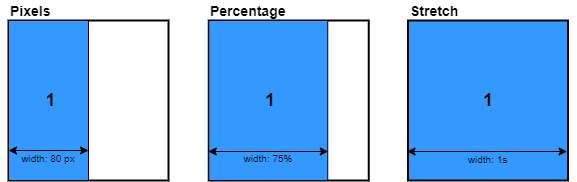
The size of a widget is determined by its width and height properties, which both have the type of Units enum, which has four variants:
- Auto:
- If the layout type is a column, then auto width will be the maximm child width and auto height will be the sum of the heights of its children.
- If the layout type is a row, then auto width will be the sum of the widths of its children and auto height will be the maximum child height.
- Stretch:
- The width/height will stretch to fill some proportion of the remaining available space. The remaining available space is the space left after subtracting the width/height of non-stretch children.
- Percentage:
- The width/height is a specified proportion of the parent width/height, unless overriden by min_/max_ width/height.
- Pixels:
- The width/height is a specified number of pixels, unless overriden by min_/max_ width/height.
Size Constraints
The width and height of a widget can be constrained by speifying a minimum and maxium using min_width, max_width, min_height, and max_height. These properties override the width and height properties and can be specified in Units:
-
Auto:
- If the layout type is a column then the min_width
-
Stretch:
-
Percentage:
-
Pixels:
Position
Child widgets added to a parent are arranged into either a vertical column, a horizontal row, or a grid and is determined by he layout_type property:
- Col:
- Child widgets are arranged into a verical column.
- Row:
- Child widgets are arranged into a horizontal row.
- Grid:
- Child widgets are positioned by a row and column indices and their size is determined by row and column spans.
Position Type
The position_type property specifies whether a widget should be affected by the position of the other child widgets.
- Parent-directed:
- The widget is positioned by the parent relative to its usual position within a column, row, or grid.
- Self-directed:
- The widget is positioned relative to the top-left corner of the parent and is not affected by sibling widgets.
Space
The position of a widget can be modified by adding space to the left, right, top, and bottom, and is also specified in Units. All four properties can be set simultaneously with the space property.
- Auto:
- The space is determined by the parents
child_spaceproperties. For example, an autoleftis overriden by the parentschild_leftproperty.
- The space is determined by the parents
- Stretch:
- The space is a specified proportion of the available remaining space.
- Percentage:
- The space is a specified proportion of the parent width/height, unless overridden by min/max constraints.
- Pixels:
- The space is a specified number of pixels, unless overridden by min/max constraints.
Space Constraints
The space properties can also be constrained with minimums and maximums, also using Units:
- Auto:
- Stretch:
- Percentage:
- Pixels:
Child Space
While space is used to set the spacing of individual widgets, child_space is used to set the spacing of all child widgets in one go, as long that the child space properties are set to auto. Child space can be considered similar to padding and is also specified in Units:
Positioning Text (TODO)
Layout Properties
Styling
Stlying lets us add properties to our widgets that change their visual appearance. Technically, layout propeties fall under styling as well, but for simplicity in learning the layout properties are detailed in a separate section of the book.
Available Properties
The table below shows the list of available style properties (layout properties are not shown for brevity). The property names are as they would appear in a css stylesheet. The property names in Rust are the same except dashes are replaced with underscores. For example, background-color in css becomes background_color in Rust.
| Property | Value Type | Default Value | Animatable |
|---|---|---|---|
| display | None | Flex | Flex | No |
| visibility | Visible | Invisible | Visible | No |
| opacity | f32 (0.0 - 1.0) | 1.0 | Yes |
| border-width | Units | Units::Auto | Yes |
| border-color | Color | Color::rgba(0,0,0,0) | Yes |
| border-radius | Units | Units::Auto | Yes |
| border-radius-top-left | Units | Units::Auto | Yes |
| border-radius-top-right | Units | Units::Auto | Yes |
| border-radius-bottom-left | Units | Units::Auto | Yes |
| border-radius-bottom-right | Units | Units::Auto | Yes |
| background-color | Color | Color::rgba(0,0,0,0) | Yes |
| background-gradient | LinearGradient | No | |
| background-image | TODO | No | |
| font | String | No | |
| color | Color | Color::black() | Yes |
| font-size | f32 | 14.0 | Yes |
| outer_shadow_h_offset | Units | Units::Auto | Yes |
| outer_shadow_v_offset | Units | Units::Auto | Yes |
| outer_shadow_blur | Units | Units::Auto | Yes |
| outer_shadow_color | Color | Color::rgba(0,0,0,0) | Yes |
| inner_shadow_h_offset | Units | Units::Auto | Yes |
| inner_shadow_v_offset | Units | Units::Auto | Yes |
| inner_shadow_blur | Units | Units::Auto | Yes |
| inner_shadow_color | Color | Color::rgba(0,0,0,0) | Yes |
Inline Styling
Inline properties refers to style and layout properties which are set on a per widget basis.
Setting styles on entities
Style properties can be set on any widget by calling a property setter on its id. For example, to set the background color of a widget:
entity.set_background_color(state, Color::blue());
where entity is the Entity id of the widget and state is a mutable reference to State. Property setters are available on the entity id thanks to the PropSet trait, which exposes setters for all of the style and layout properties.
Setting styles during widget building
It is also possible to set the style properties of a widget when the widget is built using the builder argument of the supplied closure to the build method. For example, when building a Button instance we can set its background color like so:
let button = Button::new().build(state, parent, |builder|
    builder
        .set_background_color(Color::blue())
);
The name of the setter is identical to the one used on an entity id, except now a mutable reference to State is not required because there is one internal to the builder.
Note that the widget being acted upon when setting properties on the builder may not be the same widget as the one referred to by the returned entity id.
Shared Styling
Tuix provides a way to define styles which can be shared between several widgets. This can reduce both complexity and memory usage since only the style data is stored in memory.
Shared styles in tuix follow the same rules as css stylesheets, with selectors determining which widgets are affected by which style rules. This section covers how to define shared styles in tuix. For an overview of selectors, see the next section..
Style Rules in Rust
TODO
Stylsheets
An easier way to define shared styles is with the use of css. While tuix can parse a string or file containing css, not that many of the features of css are not supported, inlcuding the cascading which gives css a part of its name.
To add a css string to tuix, call state.add_theme(css_string: &str). Tuix will then parse the supplied string for style rules and add them to the application. The css string can be defined as a constant, for example:
const STYLE: &str = #r"
    button {
        width: 100px;
        height: 30px;
        background-color: red;
    }
"#
Or the css string can be included from a file using the include_str!() macro. For example:
const STYLE: &str = include_str!("path_to_css_file");
Then, to include the styles in the tuix application call:
state.add_theme(STYLE);
Hot Reloading of Stylesheets
Inlcuding the css string as a constant means that it cannot be updated while the program is running.
Tuix provides another method of including an external stylesheet within a .css file which can be modified and reloaded. To add a reloadable stylesheet call state.add_stylesheet(path_to_css_file). This will load the contents of the file and parse any style rules. To reload the stylsheet while the application is running, press the F5 key.
Selectors
Selectors determine which shared style rules affect which widgets and work in much the same way as css selectors. The main difference being that tuix does not support all forms of selector.
Element Selector
Each type of widget can be given a unique name which can then be used to apply styles to all widgets of that type. For example, to set the background color of all button elements:
button {
    background-color: #555555;
}
The element name is typically set in the on_build method of a widget using the .set_element(state: &mut State, name: &str) method on the entity id. Unlike most other properties, a setter for the element name is not provided by the builder as the name is designed to be set for all widgets of the same type.
Class Selector
Widgets can have multiple class names which can be selected using a dot followed by the name. For example, to set the background color of all widgets with a class name of "item":
.item {
    background-color: #445566;
}
Pseudo-Selectors
Shared styles can also contain pseudoselectors which select widgets based on a particular state that the widget is in. In tuix there are 8 pseudoselectors:
Style Properties
The following sub-sections detail the styling properies currently available in tuix. This does not include the layout properties which are detailed here
Display Properties
There are three properties which affect whether a widget is displayed or not:
- display
- visibility
- opacity
Display
The display property determines whether or not a widget is included within both layout and rendering. The display property can be set to either none (Display::None), or flex (Display::Flex) which is the default. If the display property is set to none then the widget will not be included in layout and will not be rendered.
Visibility
The visibility property affects only whether a widget will be included during rendering. Unlike display, the visibility of a widget does not affect layout. The visibility property can be set to either visible (Visibility::Visible), the default, or `
Background
Border
Shadows
Overview
Overview
Tuix has a built in system for generating and dispatching events to widgets in the hioerarchy. This is how widgets can respond to interaction, such as mouse clicks and keyboard presses, and also allows for widgets to communicate with each other.
Dispatched events are placed in a queue, and then the event manager sends the events to the relevant widgets which can respond by sending their own events. This process of receiving and sending events runs within a loop called the Update Cycle until there are no more events in the queue, at which point the application may redraw before waiting for the next OS event.
Unlike a game where the application is continuously updating and rerendering at a constant frame rate, a tuix application will only update when it receives an event from Operating System (except when an animation is playing).
Messages
All events in tuix are wrapped in anEvent type which contains meta data, such as the origin, target, and propagation type of the event, as well as the message which is a boxed dynamic Message object.
Any type which implments Debug, Clone, and PartialEq automatically implements the Message trait and can be used within an Event. For example:
// Can be used as a message
#[derive(Debug, Clone, PartialEq)]
pub enum CustomEvent {
    DoSomething,
    DoSomethingWithValue(String),
}

// Create a new event with a message of CustomEvent::DoSomething with a target of entity
let event = Event::new(CustomEvent::DoSomething).target(entity);
Event Propagation
The propagation path determines which widgets will receive an event when it is dispatched by the event manager.
There are four types of event propagation:
- DownUp - The event is sent from the root to the target and then back up to the root. This means that, unless the event is consumed, many widgets along the path, except for the target, will receive the event twice.
- Down - The event propagates down from the root to the target.
- Up - The event propagates up from the target to the root.
- Fall - The event propagates from the target down the branch to the last leaf widget.
- Direct - The event is sent directly to the target and no other widgets.
Sending Events
Sending or dispatching an event is the process of adding the event to the internal event queue within State.
The insert_event() method on State allows for an event to be added to the event queue. The origin, target, and propagation type should be specified on the event before adding it to the queue.
Convenience Functions
Because the process of dispatching an event using the insert_event() method can be quite verbose, tuix provides a set of convenience methods for sending events with a particular target and propagation type and can be called directly on an entity, which then becomes the origin.
The following convenience functions take a message and generate the Event for you:
entity.emit(message: impl Message)- Sends an event with a message ofmessage, with default propagation type (DownUp), and withentityas both the target and origin.entity.emit_to(target: Entity)- Sends an event with a message ofmessage, with default propagation type (DownUp), withtargetas the target, andentityas the origin.
Event Propagation
Handling Events
Each update cycle, events in the queue will be dispatched to their target widgets. There are two primary methods for handling events sent to widgets:
-
Event Handlers allow for handling events in the same way for all intances of a particular widget type. For example, all button widgets should become 'active' when pressed.
-
Callbacks allow for handling events on a per instance basis. For example, one button widget might trigger the window to close while another button might trigger the window to go fullscreen.
Event Handlers
To receive and respond to an event, a widget type must implement the on_event() method of the Widget trait.
Here is an example from the Button widget for responding to a left mouse button press on the widget:
...
fn on_event(&mut self, state: &mut State, entity: Entity, event: &mut Event) {

    if let Some(window_event) = event.message.downcast::<WindowEvent>() {
        match window_event {
            WindowEvent::MouseDown(button) if *button == MouseButton::Left => {
                // Code which runs when the left mouse button is pressed
                // on the button widget (left out for brevity)
                ...
            }

            ...
        }
    }
}
...
Becuase the messages within events are boxed dynamic objects, the message must first be cast to the desired type with the downcast() method. Here we have specified the message type to cast to but Rust can actually infer this from the match statement that follows.
Once the message is the correct type, we can do things like match on the message type (if it's an enum) to respond to different message variants. In the above example the WindowEvent message contains a MouseDown variant which contains the mouse button which was pressed. A match guard is used to check if the mouse left button was pressed in which case it runs the contained code (left out for brevity).
Since the on_event method provides mutable access to the local properties of the widget, through self, and mutable access to the global state, through state using entity, there are a number of things that can be done within an event handler, including:
- Setting local widget properties through
self. - Setting global widget properties through
stateusing the widgetentity. - Sending events.
- Adding resources to State.
Callbacks
Callbacks are closures (functions), stored within a widget, which are triggered when a particular event is received. For example, the Button widget contains on_press and on_release callbacks which are triggered when the button is pressed (with the left nouse button) and released respectively.
Internally, this is acheived by handling the WindowEvent::MouseDown event within the event handler (on_event method) of the button which then calls the stored closures.
This example creates a new button with a callback which closes the window when pressed:
Button::new()
    .on_press(|widget: &mut Button, state: &mut State, button: Entity| {
        button.emit(state, WindowEvent::CloseWindow);
    })
    .build(state, parent, |builder| builder);
For clarity, the closure argument types have been added.
A callback can have many forms but for the standard callbacks provided by the default widgets within tuix, the arguments to the closure mirror the arguments to the on_event method, allowing for the modification of local and global properties.
In the above example the first arguement is unused as no local properties are required. However, a widget such as the Slider contains the current value, which can be used within one of the callbacks of the slider, such as the on_changing callback:
// Prints the current value of the slider while the slider value is changing,
// either by pressing the track or dragging the thumb along the track.
 Slider::new()
    .on_changing(|slider, state, entity| {
        entity.emit(WindowEvent::Debug(format!("Value: {}", slider.value)))
    })
    .build(state, parent, |builder| builder)
Window Events
Events which are sent by the Operating System and are received by the appllication window are translated into a tuix Event with a WindowEvent message type.
Introduction
While almost any desired gui behaviour can be acheived by sending events around, this can become hard to acheive when the application becomes more complex. For example, sending an event between two widgets that are far away from each other in the visual tree requires knowing the entity id of the target widget, which isn't always practical.
To solve these problems tuix has a built-in method for reactivity called binding. This section will cover bindings in detail but to begin with let's look at a basic example to see what exactly bindings achieve:
use tuix::*;

#[derive(Lens)]
pub struct AppData {
    value: i32,
}

impl Model for AppData {}

fn main() {
    let app = Application::new(WindowDescription::new(), |state, window|{
        let app_data = AppData{value: 30}.build(state, window);

        Label::new("")
            .bind(AppData::value, |value| value.to_string())
            .build(state, app_data, |builder|
                builder
                    .set_width(Pixels(100.0))
                    .set_height(Pixels(100.0))
                    .set_space(Stretch(1.0))
                    .set_child_space(Stretch(1.0))
            );
    });

    app.run();
}
This code can be found in examples/binding/basic.rs and can be run by calling cargo run --example basic.
The example above will show a window with a label in the center dispaying the number 30. This might not seem like much, but that value originates from a piece of state which has been placed into the tree and the label as aquired the value without any manual events needing to be sent, bu just calling the bind() method.
There's a lot going on here, so in the next sections we'll take a deep dive into each part of the above example and build on it as we go.
Model
For convenience, repeated here is the basic binding example from the previous section:
use tuix::*;

#[derive(Lens)]
pub struct AppData {
    value: i32,
}

impl Model for AppData {}

fn main() {
    let app = Application::new(WindowDescription::new(), |state, window|{
        let app_data = AppData{value: 30}.build(state, window);

        Label::new("")
            .bind(AppData::value, |value| value.to_string())
            .build(state, app_data, |builder|
                builder
                    .set_width(Pixels(100.0))
                    .set_height(Pixels(100.0))
                    .set_space(Stretch(1.0))
                    .set_child_space(Stretch(1.0))
            );
    });

    app.run();
}
The first part of this example is the creation of an AppData struct which contains a value with type i32. You've probably already spotted the #[derive(Lens)] macro but we'll save that for the next section.
Immediately after the declaration of this struct the trait Model is implmented for it. Model represents a piece of application state and allows us to embed it within the visual tree of widgets. However, a Model is not itself a Widget, and does not appear visually, but it can be used as a parent for a widget and can respond to events.
Mutating the Model
In the basic example the value is hard-coded when an instance of the AppData is created, and there's currently no way to modify this value. This is where events come in. A Model can respond to events in the same way as a regular widget:
#[derive(Debug, Clone, PartialEq)]
pub enum AppEvent {
    Increment,
    Decrement,
}

impl Model for AppData {
    fn on_event(&mut self, state: &mut State, entity: Entity, event: &mut Event) {
        if let Some(app_event) = event.message.downcast() {
            match app_event {
                AppEvent::Increment => {
                    self.value += 1;
                    entity.emit(state, BindEvent::Update);
                }

                AppEvent::Decrement => {
                    self.value -= 1;
                    entity.emit(state, BindEvent::Update);
                }
            }
        }
    }
}
In the above code we've created an enum to represent some events (don't forget to derive PartialEq), and the implmentation of the Model trait for AppData has been modified to respond to these events, incrementing or decrementing the value.
Notice also the call to entity.emit(state, BindEvent::Update). This event tells tuix that the model data has been modified and to update any widgets which are bound to it. Don't forget to call this when data has been modified!
With the above changes the model now has a way to be mutated. Now we just need to an AppEvent to the model. The easiest way to do this is to add some button and use the on_press callback. For example:
Button::with_label("Increment")
    .on_press(|data, state, button|{
        button.emit(state, AppEvent::Increment);
    })
    .build(state, app_data, |builder|
        builder
            .set_width(Pixels(100.0))
            .set_height(Pixels(30.0))
            .set_background_color(Color::rgb(50,50,50))
            .set_space(Stretch(1.0))
            .set_child_space(Stretch(1.0))
    );

Button::with_label("Decrement")
    .on_press(|data, state, button|{
        button.emit(state, AppEvent::Decrement);
    })
    .build(state, app_data, |builder|
        builder
            .set_width(Pixels(100.0))
            .set_height(Pixels(30.0))
            .set_background_color(Color::rgb(50,50,50))
            .set_space(Stretch(1.0))
            .set_child_space(Stretch(1.0))
    );
Notice that the buttons have the AppData as the parent. As long as the AppData instance is an ancestor of both the buttons and the label then the reactivity will work. Events are sent up to the model to mutate it and updates are sent back down to the widgets which are bound to it.
The complete code can be found in examples/binding/model.rs. Pressing the increment or decrement buttons causes the value to increase or decrease by one and the label changes automatically to show the new value.
Lens
In the previous sections we demonstrated binding a label to some data in a Model and used events to mutate the model and the text of the label updated automatically. This all seems to be possible simply by calling the bind method on a widget, so what exactly does this do, and what are its arguments?
For the basic example the binding looked like this:
.bind(AppData::value, |value| value.to_string())
The first argument to this method is a Lens. You can think of a lens as a function which takes some data as input and returns a piece of that data as output, usually as references. For example, what we need for the basic example is a function which takes an AppData and returns the value, an i32.
But the lens in the bind method above doesn't look like a function. So what's going on here?
This is where the #[derive(Lens)] macro comes in. There is a function but it's within a trait called Lens which looks like this:
pub trait Lens {
    type Source;
    type Target;

    fn view<'a>(&self, data: &'a Self::Source) -> &'a Self::Target;
}
The derive macro creates for us a zero-sized static type and then implments the Lens trait, which might look something like this:
pub struct SomeGeneratedType;

impl Lens for SomeGeneratedType {
    type Source = AppData;
    type Target = i32;

    fn view<'a>(&self, data: &'a AppData) -> &'a i32 {
        &data.value
    }
}
The other thing that the derive macro does is to create a static instance of the generated type, with the same name as the field (value), within a module called AppData. This is what allows us to use AppData::value to refer to the lens.
The second argument to the bind method is a converter closure which has as input the target type of the lens, in this case a reference to an i32 value, and has as output the expected input of the label, in this case an owned String. Therefore, to convert between the two types we use the .to_string() method on the value.
Buttons
Tuix provides a variety of built-in button widgets.
Button Types
Button is a basic push button with on_press and on_release callbacks.
CheckButton extends the basic button with on_checked and on_unchecked callbacks. This widget is useful for things like dropdown and menu items where one or more options can be selected.
Checkbox extends the check button to display a text marker when checked, a tick mark by default.
Radio is similar to a checkbox, showing a round marker when checked, but is usually used to select a single option from multiple.
Switch is another kind of widget which can be used to represent a binary option, with a sliding animation for the front marker.
Button
The button widget provides a control which can respond when pressed or released by the left mouse button.
Data
The button widget contains an optional text label which can be set with the with_label() constructor.
Styling
The button widget is composed of a single element (element name: "button") with text.
Binding
The button widget has no binding data type and thus cannot be bound to any model data.