Positioning the Button
Okay so we have a button, but it's up in the top left when really it should be in the center. If you're coming from web dev then you might be thinking, "oh no, not centering!". But fear not, it's super easy in tuix.
The way we center a widget in tuix is to add stretch spacing to all sides:
extern crate tuix;
use tuix::*;

fn main() {
    let window_description = WindowDescription::new()
        .with_title("Counter")
        .with_inner_size(400, 100);
    let app = Application::new(window_description, |state, window| {

            Button::with_label("Increment").build(state, window, |builder| {
                builder
                    .set_width(Pixels(100.0))
                    .set_height(Pixels(30.0))
                    .set_background_color(Color::rgb(20, 80, 200))
                    .set_space(Stretch(1.0))
            });

        },
    );

    app.run();
}
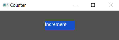
Running this code shows our button now in the center. Easy peasy!

Hang on though, what the heck is stretch space?
Okay, so while layout in tuix is highly customizable and flexible, it's quite a big topic for a quick start guide. So for now, here's a short description, and a more detailed guide can be found the the layout section.
- Widgets are positioned by their parent into a row, column, or grid with their siblings, determined by parent layout-type.
- Widgets can be moved, relative to their stack or grid position, by adding space to each of their sides, left, right, top, and bottom, (or space for all four at once).
- Space comes in four varieties:
- auto - can be overridden by parent
- stretch - a proportion of the remaining free space
- percentage - a proportion of the parent width/height
- pixels - an exact number of pixels
- The parent can apply space to all of its children, if their corresponding space properties are set to auto (which is the default unless otherwise set/specified), using child-left, child-right, child-top, child-bottom, or child-space. Also specified with the same four possible units.
- The parent can also apply horizontal space between its children, with col-between, as vertical space, with row-between. All specified with the same for possible units.
There are more rules but to keep things short the above overview should be sufficient for the rest of this quick-guide.
By adding stretch space to each side of the button we are telling tuix to add space which fills the available free space, which causes the button to become centered.
In the next section we'll look at adding more widgets and composing them together.