Styling the App
Our app now consists of two blue buttons and a gray label. Let's be honest, that doesn't look great and it doesn't feel like a GUI yet. The buttons don't even do anything when you hover and press them.
To fix this we will add style to our widgets. Tuix has two forms of styling:
- inline
- shared
So far we have defined our style properties directly on the widgets using the builder, also known as inline styling. Tuix also offers the ability to define style rules to allow shared styling between multiple widgets. The widgets affected by these shared style rules are determined by selectors which should be familiar to web developers using css and work in much the same way.
Before we can add a shared style we need to give the widgets some class names, using the .class() method on the builder, so we can target them with selectors:
Button::with_label("Decrement").build(state, row, |builder|
    builder
        .set_width(Pixels(100.0))
        .set_height(Pixels(30.0))
        .set_background_color(Color::rgb(20,80,200))
        .set_space(Stretch(1.0))
        .class("decrement")
);

Button::with_label("Increment").build(state, row, |builder|
    builder
        .set_width(Pixels(100.0))
        .set_height(Pixels(30.0))
        .set_background_color(Color::rgb(20,80,200))
        .set_space(Stretch(1.0))
        .class("increment")
);
Here we've added "increment" and "decrement" class names to our buttons. Now we can write some css to affect the styling of our widgets. Add the following to the top of the main.rs file just below the use tuix::* line:
const STYLE: &str = r#"
    button {
        border-radius: 3px;
        child-space: 1s;
    }

    button.increment {
        background-color: #2e7d32;
        border-radius: 3px;
    }

    button.increment:hover {
        background-color: #60ad5e;
    }

    button.increment:active {
        background-color: #005005;
    }

    button.decrement {
        background-color: #c62828;
        border-radius: 3px;
    }

    button.decrement:hover {
        background-color: #ff5f52;
    }

    button.decrement:active {
        background-color: #8e0000;
    }

    label {
        background-color: #404040;
        border-color: #606060;
        border-width: 1px;
        child-space: 1s;
    }
"#;
Since this isn't a css guide, we won't go into detail on how this works. But more information can be found in the styling section of the book.
Now we need to add the stylesheet to the app by calling state.add_theme(STYLE). Typically this is done in the application closure before creating any widgets.
Note also that inline properties override shared properties, so for the buttons to be affected we need to remove the calls which set their color on the builder.
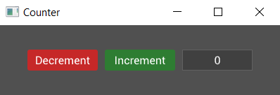
A screenshot of the result is shown below. Note also that we've now fixed the text alignment within the widgets using the child-space property, which applies to both child widgets and text.
And the complete code is:
extern crate tuix;
use tuix::*;

const STYLE: &str = r#"
    button {
        border-radius: 3px;
        child-space: 1s;
    }

    button.increment {
        background-color: #2e7d32;
        border-radius: 3px;
    }

    button.increment:hover {
        background-color: #60ad5e;
    }

    button.increment:active {
        background-color: #005005;
    }

    button.decrement {
        background-color: #c62828;
        border-radius: 3px;
    }

    button.decrement:hover {
        background-color: #ff5f52;
    }

    button.decrement:active {
        background-color: #8e0000;
    }

    label {
        background-color: #404040;
        border-color: #606060;
        border-width: 1px;
        child-space: 1s;
    }
"#;

fn main() {
    let window_description = WindowDescription::new()
        .with_title("Counter")
        .with_inner_size(400, 100);
    let app = Application::new(window_description, |state, window| {

        state.add_theme(STYLE);

        let row = Row::new().build(state, window, |builder|
            builder
                .set_child_space(Stretch(1.0))
                .set_col_between(Pixels(10.0))
        );

        Button::with_label("Decrement").build(state, row, |builder|
            builder
                .set_width(Pixels(100.0))
                .set_height(Pixels(30.0))
                .class("decrement")
        );

        Button::with_label("Increment").build(state, row, |builder|
            builder
                .set_width(Pixels(100.0))
                .set_height(Pixels(30.0))
                .class("increment")
        );

        Label::new("0").build(state, row, |builder|
            builder
                .set_width(Pixels(100.0))
                .set_height(Pixels(30.0))
        );

    });

    app.run();
}
Tuix also offers the ability to define styles in separate stylesheet files with .css extensions, which can then be included with the include_str! macro. However, although some of the style properties available in tuix share the same name as css properties, in general the available style properties are different.
Alternatively, state.add_stylesheet() can be used to add a stylesheet dynamically by specifying the path to the css file. This allows for hot reloading of the stylesheet using the F5 key, however, the css file must be shipped with the executable.
In the next section, we'll move what we've made so far into its own custom widget with a variable for the actual count.